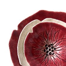
I was delighted to be commissioned recently to create some art from my swallow project for a healthcare centre, or should I say healthcare center, in the US in October. The people responsible for commissioning my swallow porcelain wall art for this piece sent me these images over of the installed work, so here they are installed :)
In this case, my wall art became ceiling art! I hope that they will in some way help, or at least distract, the people using the space for treatment. Art in healthcare is very important to me - the people close to me know that I have had my share of treatment, and I think art can help in small ways. It can't always make things right admittedly - I am not about to say that it can. But in my case, I found it gave my mind a place to wander to, and that momentarily helped me to forget that there was a drip in my arm, and that was a help. It helped me to feel less afraid, even if just for a few moments at a time. Equally, for carers it is important. I took a friend for some medical treatment recently and whilst I was pacing around the corridor, worrying and waiting for him to come out, the artwork on the walls again distracted me and soothed my mind. So I really cannot say how happy it makes me to think that I may have played a part in paying it forward. I hope to do more in this field in the future and have recently had further enquiries so fingers crossed!
Thursday, 7 January 2016
Art for healthcare and hospitals
Pantone color of the year 2016...
or if you're in the UK as I am - colour of the year ;) is not one colour this year, but two. Rose quartz, and serenity, a soft pastel pink and a balancing blue.
After last year's marsala burgundy, this comes as a light, uplifting and hopeful choice. If I am honest, by the time the marsala was named last year, I was totally bored of the hue, as in the UK it had been done to death for well over a year by then on clothing. Perhaps it's personal - it just doesn't suit my colouring!
This soft springy combination reminds me of a photo I took in Asia on my travels a few years ago. It was dusk, it was warm, the sea was like a pond, barely even a wave with just the teeniest breeze on the beach.
(The little black speck is fishermen in a little circular basket boat.)
I guess that is how that combination makes me feel, and whilst I love that, I also love the pink mixed with greys and a maybe touch of (dare I say it) marsala, with copper, black or dark gold accessories, like these combos found on pinterest via www.love4home.eu :
Love the softness of the bottom three - so stylish!
I have some new ideas in the pipeline (top secret just yet!) for my ceramics that might fit well with this pallete... time will tell.
Subscribe to:
Comments (Atom)


