


I made a batch of these, and the rest of them came out this evening... They look great as a group - as soon as there is good light I will take some shots of them.
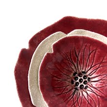
They are pinch pots, and I have always been a little obsessive about making my pinch pots as thin as possible. I was told a long time ago that thin pinch pots wouldn't work... that was like a red rag to a bull - I have made hundreds that worked fine since I was told that! Making pinch pots this thin from porcelain has been a challenge I have to say, but I got there in the end... I won't tell you how many casualties there were along the way. The effect of making them so thin out of porcelain, and firing it pretty hot is that it vitrifies, and becomes translucent. The next image shows what happens when you hold it up to the light.
 This was daylight from inside through a north facing window on a bright-ish day. I think it is amazing, the way you can see through the thinner parts more. It reminds me of real petals! You can even see in the centre the indent in the back where I created a recess for a pin in the wall to hold it up.
The only drawback has been how to present them. I experimented with a few different backdrops, and have had to deviate from my rule. Up until now everything I put on my shop had to be photographed with a white background. The trouble with these was that it was like looking for a polar bear in a snowstorm - you just couldn't make out clearly where the flower ended and the backdrop began. I tried pink...
 And whilst I liked it in a way, I didn't think it really emphasized their subtlety. But then maybe it shows their versatility. I just can't help but think of these as whisperers not shouters! So I have chosen grey - I think it works a lot better. The only downside is that I can feel the OCD part of me twitching in panic about the fact that now not every single piece in my shop has a white background...
Opinions on the colour, and anything else of course, are as always appreciated!


2 comments:
I love the pink...but I understand about being OCD too! That's me! I always love bright colors. Why be bland when there's a whole rainbow? But the grey works with your shop of all white backgrounds.
I think the pink may make people think, "Whoa, what's goin on over here?", draw more interest, and shake things up a bit! All in all, it's your business, and you do what feels right!
I love the translucence of the porcelain; how delicate the petals look. I have just started to throw in porcelain in my ceramics class in college and I am looking forward to seeing what happens after I fire my pieces.
Post a Comment