I get a lot of messages from people who are unsure of how a piece of art will look in their home, and are struggling with ideas of placement or scale. Luckily, I was an interior designer for nearly a decade before I started my ceramics business, so I have a trick or two to share!
So, what is the best way to choose art for your home? Well, let's imagine that you have found an image, a print or a photograph that you like on the internet, and the artist offers that in either one size or a choice of sizes. Simply stick together paper ( recycling newspaper will often suffice ) and cut it out to the correct size. Simply tack it onto your wall, and there you have it - the issue of scale is resolved. It will either look good or it won't. If you can see the image at the same time, on a screen for example, then that's all the better - this combination of factors really gives you an idea of how a piece will feel in your home.
If you find that it isn't the right scale for you, consider asking the artist if they could do it in any other size. I am always happy to work with a customer to get the perfect number, scale, personal touch or special colour to suit their room, and I am sure other artists are too.
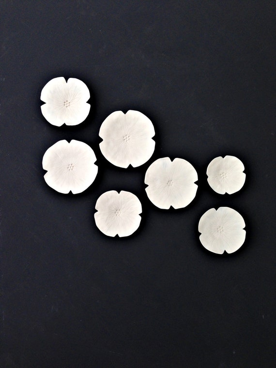
Often, people ask this when choosing my
Grace wall art. It's really simple - just cut out circles of paper to approximate sizes and tack them on. It's a great trick when you're arranging them after a purchase too, to make sure you get them in the right place.
In terms of colour, it is an incredibly personal choice. I always find that a contrast to your wall colour is best. So light things on mid tone or dark walls and vice versa. Picking out colours from your decor scheme is often a good idea too, although it might be that you're going to own the art for longer than your current decor scheme lasts, so picking colours you love is the main thing. I like white for artwork, because it just looks fantastic on such a wide range of coloured walls, but it really is a great opportunity to introduce colour to a room too.
Above all, the best advice I think when choosing art is that you absolutely love it. You're going to see it most days if it is to be in your home, so make sure it is special to you.




 Posts
Posts