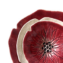
After last year's marsala burgundy, this comes as a light, uplifting and hopeful choice. If I am honest, by the time the marsala was named last year, I was totally bored of the hue, as in the UK it had been done to death for well over a year by then on clothing. Perhaps it's personal - it just doesn't suit my colouring!
This soft springy combination reminds me of a photo I took in Asia on my travels a few years ago. It was dusk, it was warm, the sea was like a pond, barely even a wave with just the teeniest breeze on the beach.

(The little black speck is fishermen in a little circular basket boat.)
I guess that is how that combination makes me feel, and whilst I love that, I also love the pink mixed with greys and a maybe touch of (dare I say it) marsala, with copper, black or dark gold accessories, like these combos found on pinterest via www.love4home.eu :


Love the softness of the bottom three - so stylish!
I have some new ideas in the pipeline (top secret just yet!) for my ceramics that might fit well with this pallete... time will tell.



 Posts
Posts